REI Blackbook

User Settings Dashboard
Client: REI Blackbook
Category: UX Design
Date: Oct 2020
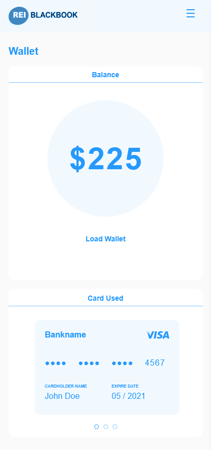
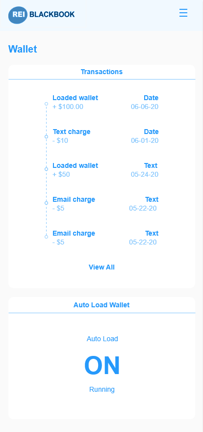
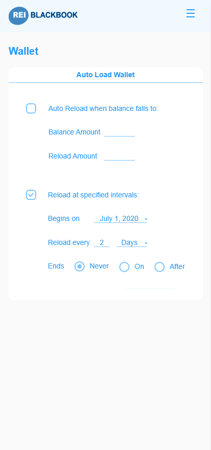
The settings dashboard in the REI Blackbook app was very outdated and not only needed a fresh makeover, but an easier experience and flow. Users were not able to easily view their current plan or what came with it. There also had to be a design that assisted our new wallet upgrade. This would allow users to add money to their wallet to be used by text messaging, email, or voicemail features within the app.
Goals
- Simplify backend settings for ease of use
- Add in visual interfaces to display usage
- Design the look of the newer features such as the wallet
Challenges
- Designing within the constraints of the platform it was built on.
- Utilizing the space properly while making room for all of the new features and future features to be added.
My Role
- Listened to stakeholders vision of what they would like to see
- Created the wireframe and prototype of the project vision
- Get feedback from stakeholders and users
- Updated the design with the new feedback for approval
- Handed finished design over to dev
The Process
1. Requirements Gathering
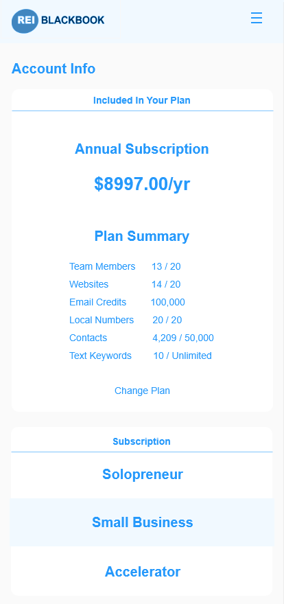
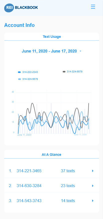
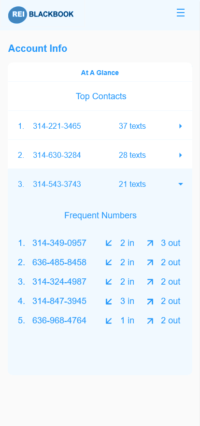
Power users and new users alike were surveyed on what specific things would help them use the REI Blackbook better and what changes would they like to see? A majority of the responses had to do with an area of the site that relatively been untouched. It was the My Account section, and users really wanted to get a handle on what they were paying for. They wanted better reporting and easier ways to change their plans.
The following requirements were some of the top voted items from User Feedback that stakeholders deemed important enough to address first.
- Users needed an easy way to see their current plan
- Users needed the ability to change plan without calling customer service
- Users needed to be able to see usage and remaining balance
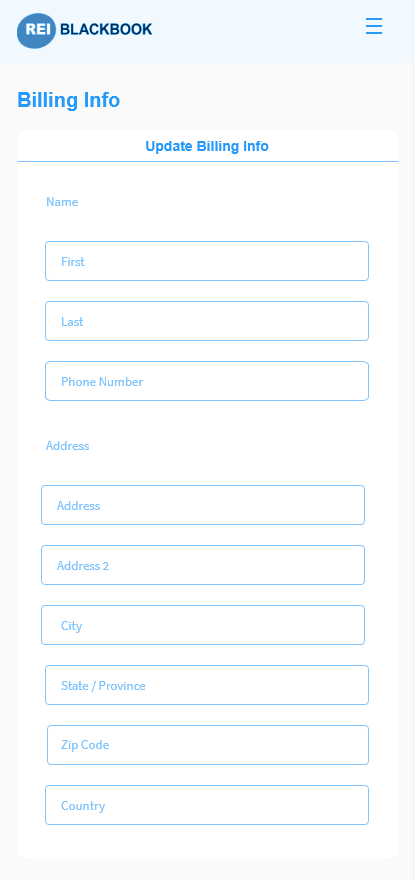
- Users needed an easier way update their credit card
- *New Feature* Add in interface for wallet system


2. Sorting out confusion
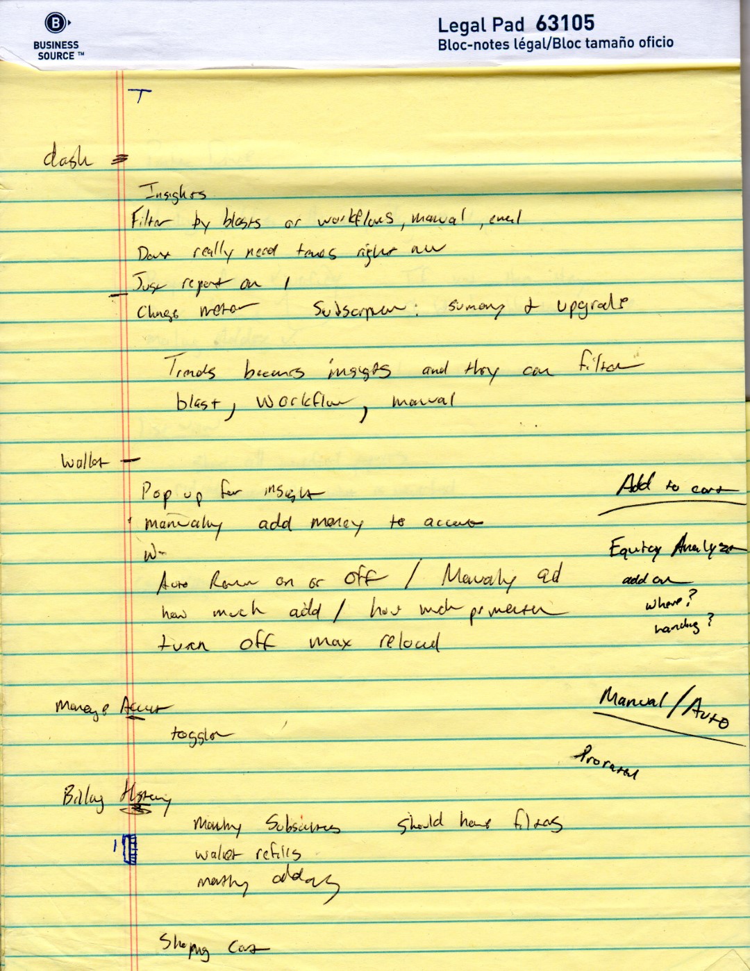
When a new project is introduced, my mind escapes to a world of possibilities, and this messy part of the process is just getting things out of my head and on paper. Any designs that pop up in my mind, bullet points, definitions, notes, all gets written down.
From this brain dump, i start to organize things on post it notes, or white board on what the flow is going to look like, as well as the screens and steps that are needed
")
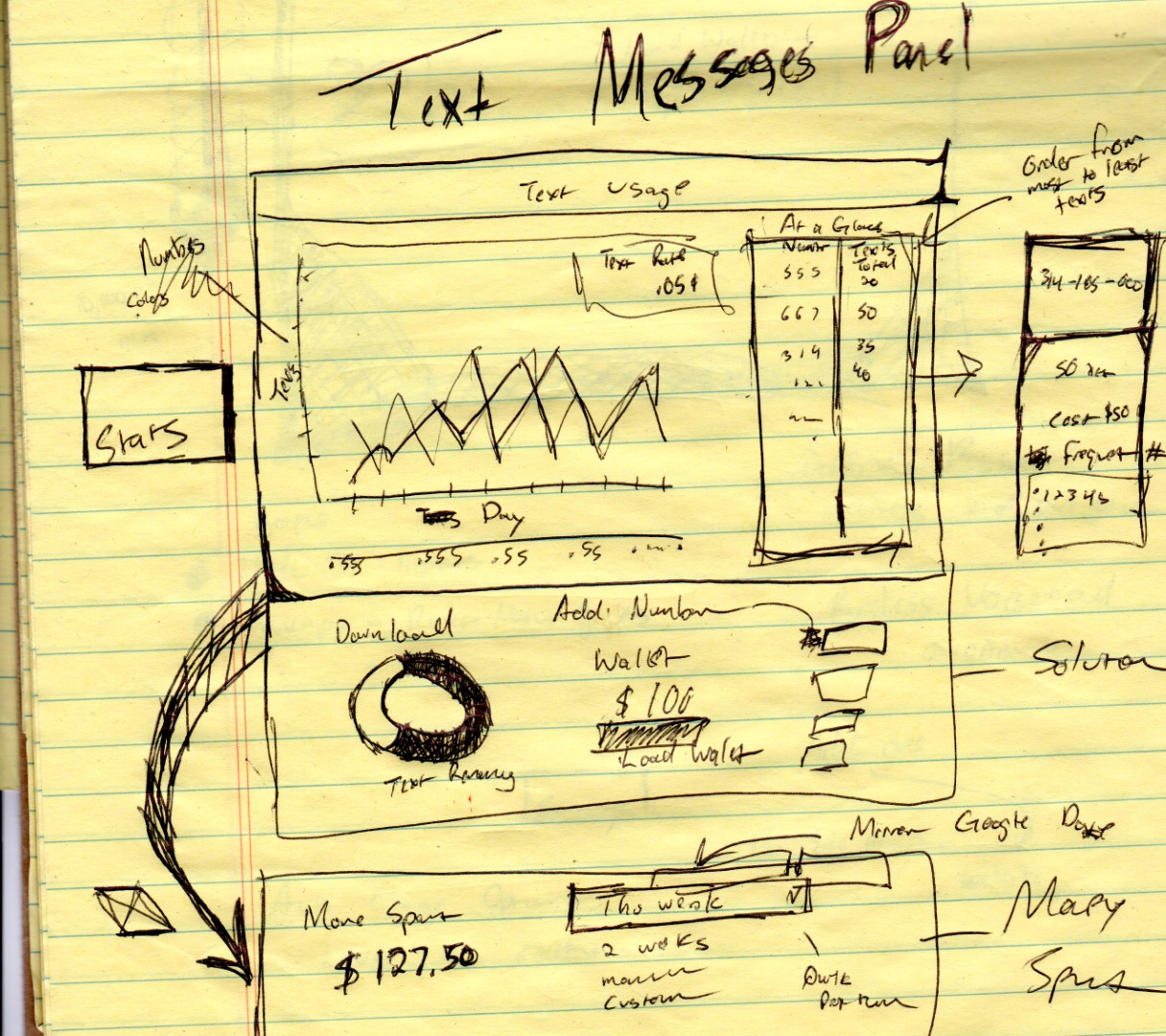
3. Wireframing
My wireframes are usually much more simple. However, being the only UX designer in the building and working with people who are very visual, I went just a little further to illustrate the ideas than usual boxes and circles.

4. Prototype
When the prototype is built and all the pages are linked for a simulated walk through, I would hold a meeting either online or in person and do a walkthrough with co-workers and stakeholders to continue getting their feedback. Users would get their own walkthrough and feedback session with a link to the prototype.

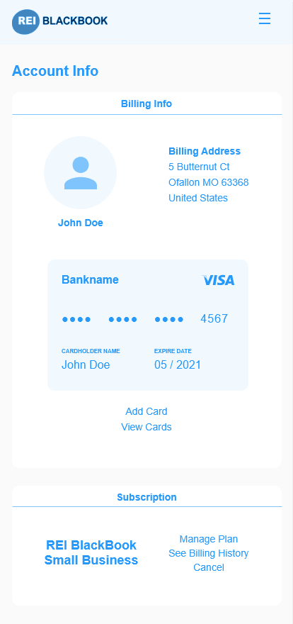
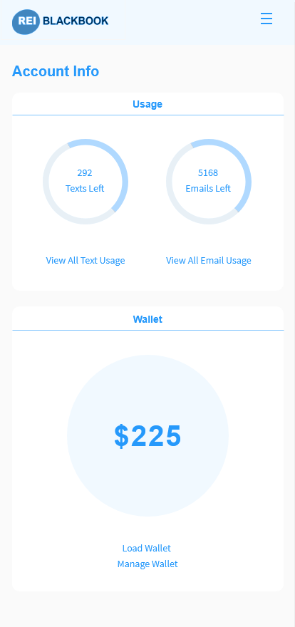
Screenshots
")
")
")
")
")